
Sometimes you don't need statistics. Sometimes you don't need retrospectives. Sometimes you don't need superlatives.
Burn Your Burn-down Charts
In many articles on Scrum, the traditional burn-down chart is still depicted as the preferred method for displaying progress in a sprint or project. However, since the introduction of burn-down charts, several improvements have been suggested by leading authors and experts. I agree with each one of them, and my suggestion to you is to try these ideas, and turn your charting practices completely upside-down!
Scope Change
In "Earned-value and Burn Charts" Alistair Cockburn has described that burn-down charts can be inconvenient when trying to depict a change in scope. This may not be a problem for burn charts in sprints (as the scope is not allowed to change during a sprint) but it is quite relevant for charts depicting the total project. Burn-up charts (the mirror image of burn-down charts) are better suited for charting progress for an entire project, because any changes in the top line clearly indicate changes to the total scope.
Bottlenecks
In "Managing with Cumulative Flow Diagrams" David J. Anderson described how these burn-up charts can be further improved by depicting different stages in development. For example: by drawing different lines for work items that have passed the stages of In Progress, Reviewed, Tested and Deployed it is much easier to identify any bottlenecks in your development pipeline. (Bottlenecks manifest themselves as diverging lines in the burn-up chart.)

In this chart, taken from a real project, you can see that our Beta OK and Live OK statuses were falling behind, as compared to the In Progress and Team Review/OK statuses. In this project this meant that, for a short while, work was being reviewed but not being deployed to the beta test environment, possibly for technical reasons. Apparently, this was suddenly corrected around the 10th of June.
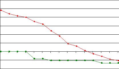
Budgets
In "Agile Charts" John Rusk has shown us that burn charts are missing another key ingredient for many project managers. Burn charts tell you whether the project is on schedule, but not whether it is on budget. This is particularly relevant for development shops (including ours) where teams are doing fixed-price projects. John proposed another enhancement, by adding a burned budget line to the charts.

In this chart, taken from the same real project, you can see that spending of the budget followed a traditional S-Curve. The project actually finished just below the original estimate (the red line). (Smart people would be able to merge this chart with the burn-up chart. I'm not that smart, so I keep them separate.)
These ideas, and many more, are also described at length in my own paper called "Progress in Three Dimensions" (PDF, 280KB). And if you are convinced that the improved versions are better than the original burn-down charts, then I suggest that you burn your burn-down charts and chart some new territories for measuring progress in your projects!
Subscribe to this blog with a reader or by email!
Latest, greatest and favoritest posts:
10 Principles of Agile Project Time Management
The Single Best Source Control Model
MoSCoW Priorities
Related Posts
Related Posts

GET MY FREE BOOK!
“How to Change the World”
GET MY FREE BOOK!
“How to Change the World”
  |